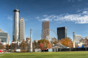
If you’re thinking about moving to The Big Peach and plan to rent an apartment in Atlanta, GA or buy a home, Atlanta is a city that’s guaranteed to captivate you from the moment you arrive. From the bustling city with rich history, mouth-watering cuisine, and endless opportunities for adventure, or the iconic museums and stunning parks to bustling markets and lively music venues, you certainly won’t run out of things to do.
To help you make the most of your time living in Atlanta, we’ve put together a list of must-try Atlanta bucket-list experiences. From savoring the local flavors at Ponce City Market to exploring the vibrant Atlanta neighborhoods that make this city unique, these are just some of the unique things to do in Atlanta that will make you fall in love with the city and the lifestyle it has to offer. So grab your walking shoes and your sense of adventure, and get ready to dive into the ultimate Atlanta bucket list.

1. Spend a day at Ponce City Market
“You absolutely, positively, need to spend a day at Ponce City Market,” states Ash Brown, a local Lifestyle Blogger, Podcast Host and Event Emcee, and CEO of Ash Said It. “This historic building was the old Sears, Roebuck & Co Building. The renovations here are incredible. The decor and infrastructure are a whole mood. Some of my favorite places are here such as Five daughter bakery, Bar Vegan, Modern Mystic Shop and many more. At the end of the night stop by City Winery Atlanta for local made wine. You may even catch your favorite entertainment act there.”
2. Visit the Martin Luther King Jr. National Historical Park
“No trip to Atlanta is complete without a visit to the Martin Luther King Jr. National Historical Park,” says local photographer, Corey Reese Photography. “This historic site honors the life and legacy of the civil rights icon and features a museum, his childhood home, and the iconic Ebenezer Baptist Church. It’s a must-see for anyone interested in American history and social justice.”
3. Check out the High Museum of Art
“For a taste of the city’s art and culture scene, head to the High Museum of Art,” also suggests Reese. “This world-class museum boasts an impressive collection of art, from classic to contemporary, and regularly hosts special exhibitions and events. It’s a great way to spend a leisurely afternoon and appreciate the beauty of Atlanta’s creative spirit.”
4. Indulge in the food scene of Atlanta
“The joy of a new Atlanta resident is unmatched, shares Courtney Paige, Founder of A Paige Of Positivity. “We lived in the city for over three years, and I still dream about some of our favorite restaurants. Fudo Sushi in Brookhaven has my highest recommendation. After trying over 16 of their rolls, the ‘Fantasy Roll’ is the best. Get the dynamite shrimp and miso cauliflower to start.”
“Thinking about ordering in? Kong’s Kitchen in Midtown has the best Chinese food I’ve ever had – specifically the Chicken Lo Mein,” suggests Paige. “Have it delivered, as there isn’t even a parking lot to pick it up from, it’s just Peachtree Rd and you’ll see a line of 10+ delivery drivers picking it up too.”
Or, if you’re looking for rooftop views, Paige recommends heading over to the Kimpton Hotel. “Located in Buckhead, grab a drink at the St. Julep bar in the Kimpton Hotel, or buzz down to West Midtown and grab a seat on the patio of the Bellview Hotel. End your night with Emmy’s Squared Pizza, specifically the vodka sauce pizza.”
5. Explore the Atlanta BeltLine
Erica Valentin, a Life, Style, and Travel blogger at Wander in Color shares, “For the quintessential Atlanta experience, you absolutely must visit the Atlanta Beltline. This 22 mile open loop is a dream to visit by foot, or on skates or a bicycle. People from all walks of life love the Beltline because all are welcome here and even fur-friends love it! Spend the day shopping at Ponce City Market or enjoying one of its many restaurants or just hanging out with friends, There’s something for everyone.”
A Paige Of Positivity dives into the bucket list food stops along the beltline. “Take time to explore and walk the Atlanta BeltLine. Start at Krog Street Market and walk north, headed towards Piedmont Park. Along the way, grab a brew at New Realm Brewing and play some cornhole. Stop into Ladybird Grove & Mess Hall and enjoy the sea of people and dogs. Pop into Ponce City Market and grab some street food at one of the many fabulous vendors.”

6. Visit the National Center for Civil and Human Rights
“The National Center for Civil and Human Rights is a cultural center that focuses both on the Civil Rights Movement in the United States and the fight for human rights around the world,” explains Amanda Young, blogger of Young & Wanderlust. “The museum features interactive exhibits (such as a lunch counter sit-in simulation), personal letters from Dr. Martin Luther King, Jr., a sobering gallery of both human rights leaders and abusers, and more. As the birthplace of Dr. King, Atlanta was an integral part of the Civil Rights Movement, and visiting this museum is the perfect way to honor that legacy.”
7. Spend a day in the West Side neighborhood
“If you’re new to Atlanta, you have to check out the West Side,” states Jessica Camerata, owner of An Indigo Day and Founder of The Blog Societies. “You can spend an entire day there from shopping at Free People and Ann Mashburn. Grab something sweet at Five Daughter’s Bakery. My favorite spot for lunch is Falafel Nation. Best falafel in town. And for dinner, check out Forza Storico or Aziza for an unforgettable meal. Finish it off with a cocktail at Marcel and a scoop of Brambleberry crisp at Jeni’s Ice Cream.”
8. Dine at Holeman & Finch
“As a new resident of Atlanta, one activity that should be on your bucket list is dining at Holeman & Finch in Midtown in Colony Square,” shares Banner Butter, a small batch butter producer in Atlanta. “This local gem is a must-visit for foodies and offers a dining experience that is both refined and approachable. Additionally, Chef Linton’s culinary creativity shines through in their seasonal menu, where Banner Butter is often featured in innovative and delicious ways.”
9. Explore Little Five Points
Young also recommends checking out Little Five Points. “Little Five Points is a neighborhood with crystal shops, vintage and thrift stores, delicious vegan food, and more,” shares Young. “Eat at Govinda’s Cafe, a non-profit vegan restaurant in Atlanta that aims to serve its community in a meaningful way, and check out Sevananda Natural Foods, a health food store with a hot bar (hello fluffy vegan biscuits!). You can also explore the street art and browse the Junkman’s Daughter, a huge store with unique jewelry, decorations, clothes, and more.”

10. Get your southern fix at Ms. Icey’s Kitchen and Bar
“Located in North Decatur, just 7 miles from downtown Atlanta, Ms. Icey’s Kitchen & Bar is a must try,” states Deverick Long, author at The Hip-Hop Foodie. “Their menu offers the traditional southern food that Atlanta is known for, with a mashup of Caribbean cuisine. The in-house DJ and great service creates the ultimate dining experience.
11. Book a tee time
“If you’re new to Atlanta, you’re in for a treat when it comes to all around top tier experiences with events, restaurants, and attractions,” shares Onteria West, Digital Content Creator and Owner of Our West Nest. “One of my favorite places to visit is Puttshack. It’s a swanky miniature golf establishment that is perfect for everything, from a day to enjoy with family, to brunch with friends, and even date night with your partner. Though the establishment is for miniature golf, their inside restaurant also has excellent eats and drinks, plus a swaggy DJ in the evenings.”
12. Search for Tiny Doors ATL
“Artist Karen Anderson Singer has painted a number of 7-inch doors throughout the city, meant to ‘reflect the spirit, architecture, and other unique elements of the surrounding community,’” explains Young. “They’re all labeled, and the designs are adorable. You can find the doors at the Old Fourth Ward Skate Park, Swan House, Fox Theatre, and more.”

13. Enjoy nature in Roswell Mill Park
“As a local Photographer based in Sandy Springs (North Atlanta), I am always on the lookout for quiet and beautiful places to take photos in Atlanta,” says Nina Ferentinos. “One of my favorite places that also has a lot of variety in natural backdrops is Roswell Mill Park. It features a waterfall, access to the river, and wooded nature trails that are partly even wheelchair accessible.”
“When I am not working we like to explore the City Springs area, which is within walking distance from our Sandy Springs house,” explains Ferentinos. “About 2 years ago we discovered The Select and fell in love with their french inspired cuisine and the extraordinary cocktail selection. You have to try the ‘Birds of Paradise’ that are being presented in a bird-shaped cocktail class.”
14. Discover Chattahoochee National Recreation Area
“Atlanta is lush with trees—magnolias, dogwoods, pine trees, and hardwoods including magnificent oaks,” shares chef and James Beard award winning cookbook author, Virginia Willis. “One of the best places to experience this green space is in the Chattahoochee National Recreation Area. Established by President Jimmy Carter, the parks offer extraordinary opportunities to enjoy the outdoors in Atlanta and the suburbs just north of the city. The park preserves 48 miles of river and more than 50 miles of hiking trails along the river’s banks. It’s one of my favorite things about living in Atlanta.”
15. Be part of the community growth
“Atlanta has grown dramatically over the last twenty years,” states E Vincent Martinez, founder of Fashionado, a fashion and lifestyle brand. “It’s become a city rich in the arts, entertainment and fashion scenes. “The ‘rebirth’ of historic places like the old city hall which is now Ponce City Market or more recently, The Works ATL located in the Upper West Side, have given Atlanta a day-to-night vibrancy. The walkability of the city has also evolved tremendously, especially in Midtown and Old Fourth Ward, much of it made possible via the Atlanta Beltline which is the perfect stretch to get to know the city and grab a bite or drink. Shopping and dining are also on my list. Just about every major retailer and luxury brand has a presence in Atlanta and if you’re new to the city, you won’t go hungry as there are many great restaurants to enjoy.”

16. Solve clues at an escape room
“Don’t miss out on the high-tech, artful escape rooms at The Escape Game at the Atlanta Battery,” suggests Lindsey Paris Designer and writer at Redhead Baby Mama. “The intensely-themed rooms are completely immersive and worth the price of admission. Grab a group and be sure to try out ‘Playground!’ You’ll feel like a kid all over again.”
17. Explore Atlanta’s Vibrant Pop-Up Dining Scene
“With almost 200 events a week, Atlanta’s pop-up restaurant scene is a defining force in the city’s dining scene,” says Sam Flemming of Punk Foodie, which keeps close tabs on the scene.
With a surprising number of the city’s hottest restaurants tracing their origins as pop-ups, including Pho Cue, OK YAKI, Lazy Betty and Little Bear, Flemming says eating at a pop-up is experiencing the future of the city’s vibrant dining scene. Flemming suggests trying the Pimento KimCheese Rangoons from Ganji, the Mapo Chili Dog from Jackalope, and the Waffle House Style Pierogies from Bravewojtek. Follow Punk Foodie’s Instagram or subscribe to their newsletter.
18. Experience the luxurious side of Atlanta
“If you’re looking to elevate your Atlanta experience, you simply must check out Rooftop LOA,” suggests Oh! Nikka, an Atlanta-based fashion, food, and lifestyle blog. “This multilevel rooftop resort is the ultimate way to soak up the sun with poolside relaxation while indulging in eclectic dining, sipping on chic cocktails, and taking in sweeping views of the city.”
“The new Rooftop L.O.A by Slater Hospitality is a resort-like rooftop destination for any new Atlantan to explore,” shares Adventures in Atlanta, a guide to Atlanta-based regional, and national festivals, concerts, restaurant openings, events, and more. “Take a leave of absence for the day to their three distinct areas encompassing the newly opened pool, grove, and upscale restaurant and bar. The pool is the IT destination this summer with a separate bar focusing on Miami-vibe and resort food and drink fare. The grove area is the perfect area to lounge for garden style cocktails by the fire pit. Finally, grab a bite and a martini at the restaurant boasting an array of eats from Burgers to whole fish to steaks.”
Atlanta, GA is a city that never fails to impress. Its rich history, diverse culture, and endless array of attractions and experiences make it an ideal destination for anyone looking to explore and discover something new. From iconic landmarks like the Martin Luther King Jr. National Historic Site and the World of Coca-Cola to hidden gems like Krog Street Market and the Beltline,there are countless reasons to move to Atlanta.


 United States
 Canada